Share
With more than 20,000 datasets available on HDX, we are always looking for ways to help our community find the right data. In recent research we conducted with the Data Nutrition Project, we learned that HDX users are looking for straightforward ways to assess similar datasets. We are exploring new functionality that could offer side-by-side metadata and visual comparisons. As part of this exploration, we compared two sources of health facility data on HDX. We explain the results below.
Data Summary
Health facilities database compiled by researchers
One popular source of health facility data on HDX comes from a team of researchers at the Kenya Medical Research Institute working with the Wellcome Trust Research Programme. Their extensive database includes almost 100,000 public health facilities from over 50 countries and islands in sub-Saharan Africa. To ensure its reliability, the data was compiled using a diverse range of government and non-government sources and underwent rigorous validation. The data has not received regular updates since 2019.
Health facilities data shared by HOT
Another valuable source of health facilities data on HDX comes from the Humanitarian OpenStreetMap Team (HOT). The data is derived from a crowdsourcing method that leverages OpenStreetMap (OSM) and is available for 240 countries and territories. The data is contributed to OSM in one of three ways: 1) in-person, mobile data collection that is focused on the location of specific infrastructure; 2) remote sensing and digitization from satellite imagery or unmanned aerial vehicles to create building and road datasets; or 3) importing existing datasets from governments and organizations. The data is updated on a rolling basis.
Metadata Comparison
The table below provides a side-by-side comparison of the metadata for each health facility dataset.
| Source | HOT | Research Programme Database |
| Dataset date | Ongoing | 2019 |
| Update frequency | Monthly | Never |
| Geographic coverage | World | sub-Saharan Africa |
| Methodology | Volunteer mapping community | Country-specific public health facility databases |
| Attributes provided | Name, facility type, capacity, address, source | Name, facility type, ownership, source |
| Availability of attribute information | Low – most are blank | High – almost all have values |
Visual Comparison
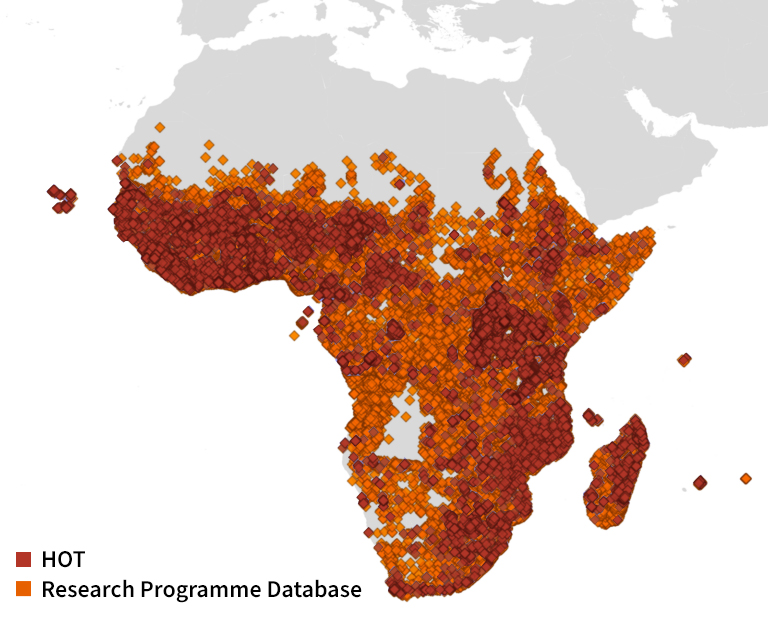
We mapped both health facilities datasets using QGIS to better understand their respective geographic coverage. Looking at sub-Saharan Africa, we found that the database compiled by the researchers contains more data points overall and has more complete coverage in certain regions.
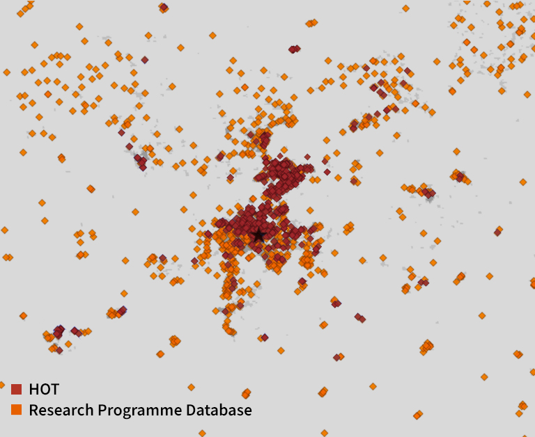
 We then narrowed our comparison to Johannesburg and the surrounding area. The HOT data exhibits a concentration of points in the urban center but is sparse in rural surroundings, whereas the research programme data is more evenly distributed across both urban and rural areas. (The background data is from the Global Human Settlement Layer; the darker grey indicates areas of greater urban density).
Conclusion
Both sources of health facilities data are useful depending on the analysis being performed. While the data from the research team is older, it has broader geographic coverage than data from HOT. The datasets can complement each other, allowing HDX users to draw insights from one or both for greater value. We are grateful to both organizations for sharing their data openly on HDX.
Let us know if this analysis is useful and if this is something you would like to see featured on HDX. Send feedback and requests for new dataset comparisons to hdx@un.org.