Share
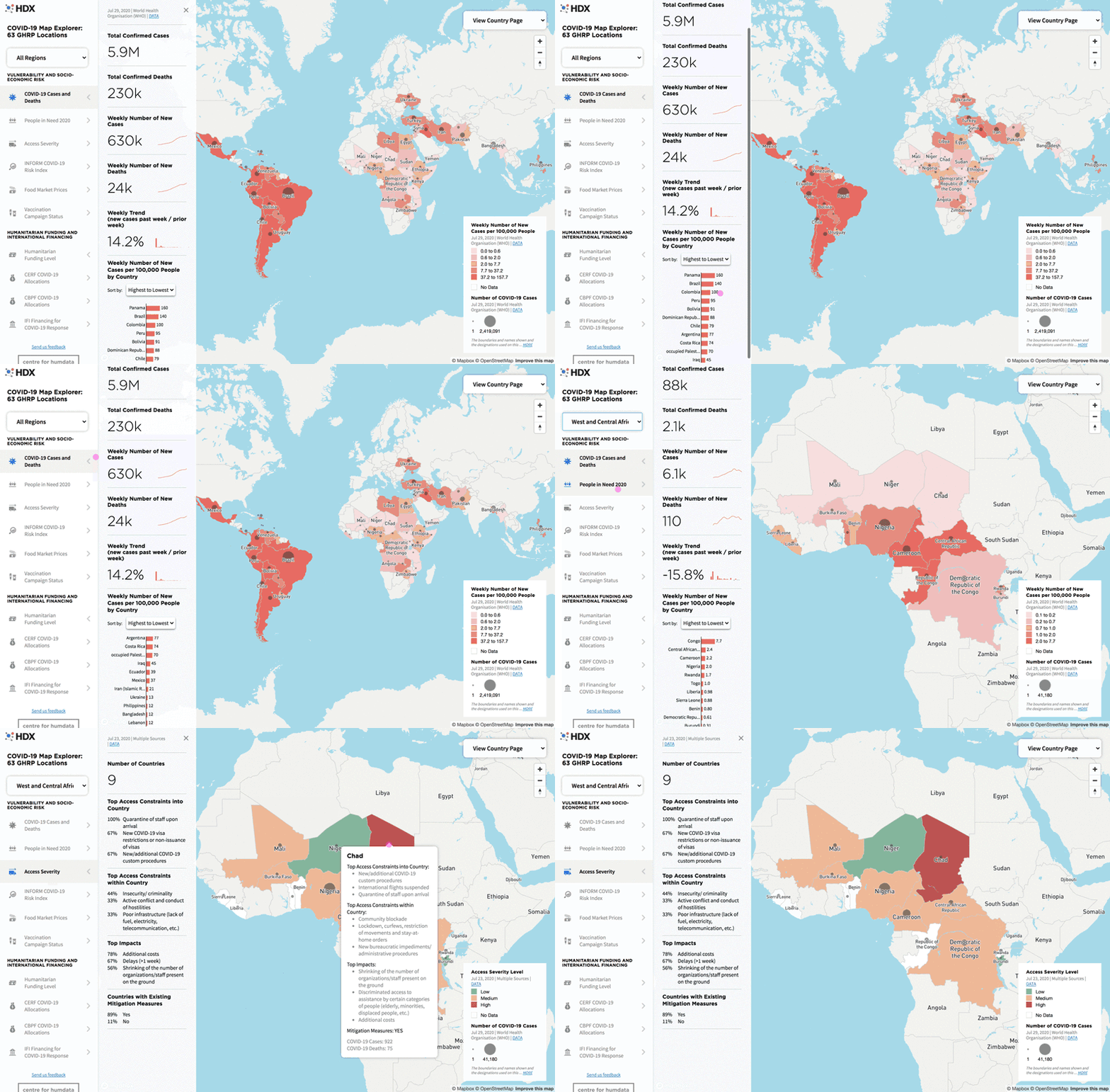
About one-third of the 17 million global COVID-19 cases are coming from 63 countries that have a refugee or humanitarian operation. To help understand the progress of the virus and its impact on already vulnerable people in these locations, we have created a map explorer that brings together dozens of datasets from over 20 sources. We hope this tool is useful to decision makers as they prioritize resources in a time of unprecedented need.
Although there are many useful visualizations available to monitor the spread of the virus, OCHA management was looking for a way to focus specifically on the countries included in the COVID-19 Global Humanitarian Response Plan (GHRP), which was launched in April. The request was to bring together data related to underlying vulnerability and socio-economic risk as well as the level of humanitarian and international financing going towards the response. For instance, how are the mitigation measures for COVID-19 affecting access to humanitarian assistance and planned vaccination campaigns, and where are we seeing countries fall into deeper need because of insufficient funds?
Some of the key datasets you can view in the map explorer include:
- COVID-19 cases and deaths, from WHO.
- The number of people in need, refugees and internally displaced people, from OCHA, UNHCR and IDMC.
- The top access constraints into and within countries and their impact, from OCHA.
- Food market prices across a range of commodities, from WFP, and acute food insecurity, from National IPC Technical Working Groups.
- The status of current vaccination campaigns and annual vaccination levels, from ministries of health.
- Humanitarian funding levels for the GHRP, as well as CERF and pooled fund allocations, from OCHA.
- Grants and loans from International Financing Institutions such as the World Bank and IMF, collated by OCHA.

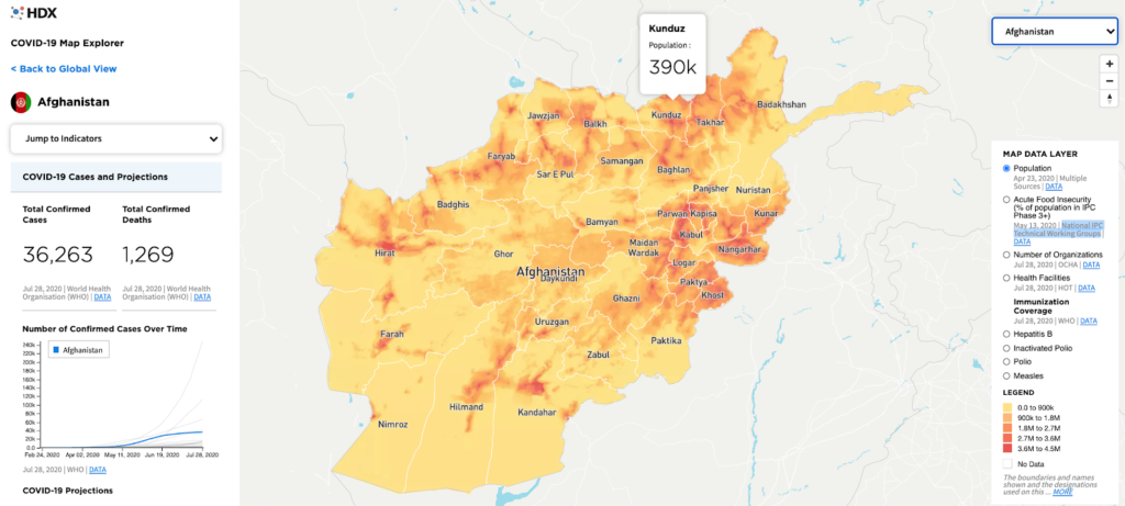
The visual allows you to explore this data across all 63 GHRP countries and to filter this by region, from Latin America and the Caribbean to West and Central Africa. It is also possible to see the data just for the 25 countries with a Humanitarian Response Plan (HRP). And for the HRP locations, there is a country view that shows province-level (admin 1) population density, the number of active organizations, the number of health facilities and more.

For those of you who are interested in how we created this, keep reading. For non-technical readers, start exploring and let us know what insights you find and how we can keep improving the tool.
Data Integration
The visualization is driven by data derived from a large number of datasets — around 50 in total. Not that long ago, bringing such a wide range of data into a visualization and keeping it up to date would have been unfeasible. At best, such a project would end up being an expensive one-off exercise because maintenance would be too costly due to the manual steps needed to obtain and clean the data.
We were determined to avoid this trap. Doing this required us to build a sustainable framework for downloading and transforming a sizable number of datasets as we anticipated that new lines of inquiry would inevitably require new data to be processed.
We developed the framework for this process from scratch. The source code is open and available in GitHub. It consists of Python code configured by a YAML file, which describes the data sources and the transformations to be performed in most cases. For a few sources, the steps required are too specific to be generalized so these have custom scripts. The data update is run automatically every day by GitHub Actions and the output, which has HXL hashtags for easy machine interpretation of columns, is stored in both Google sheets for human inspection and in the repository in JSON to power the visualization.
The input and output to each data source’s processor is standardized. The dataset for each source is hosted on HDX which means that there is metadata available for display. With this modular design, new data is easy to append to the existing data, which is especially important because the visualization shows data at global, regional, national and subnational (admin 1) levels. This demands a structured approach to synchronising the data at each level.
The subnational layer presented a specific challenge: most data does not come with standardized geographic codes (p-codes) to describe locations but instead has admin names that could be transliterated from other languages like Arabic into English in multiple ways. To solve this problem, we used phonetic name matching. This was surprisingly effective, leaving only a few names to be mapped manually in the configuration file.
The Map
We use Mapbox to generate the background map, which is based on OpenStreetMap data. This allowed us to quickly get a background with some basic details and focus our efforts on creating our own custom data layers and interactivity. (And special thanks to the amazing Mapbox team who have been a great help along the way).
The national and subnational boundaries were taken from the common operational datasets, maintained by the humanitarian community and made available by OCHA on HDX. Each of these boundary files was loaded into the Mapbox vector tiles service where it can be streamed to users’ browsers as-needed. Javascript in the webpage then joins those boundaries to the indicator data selected by the user and assigns the appropriate color.
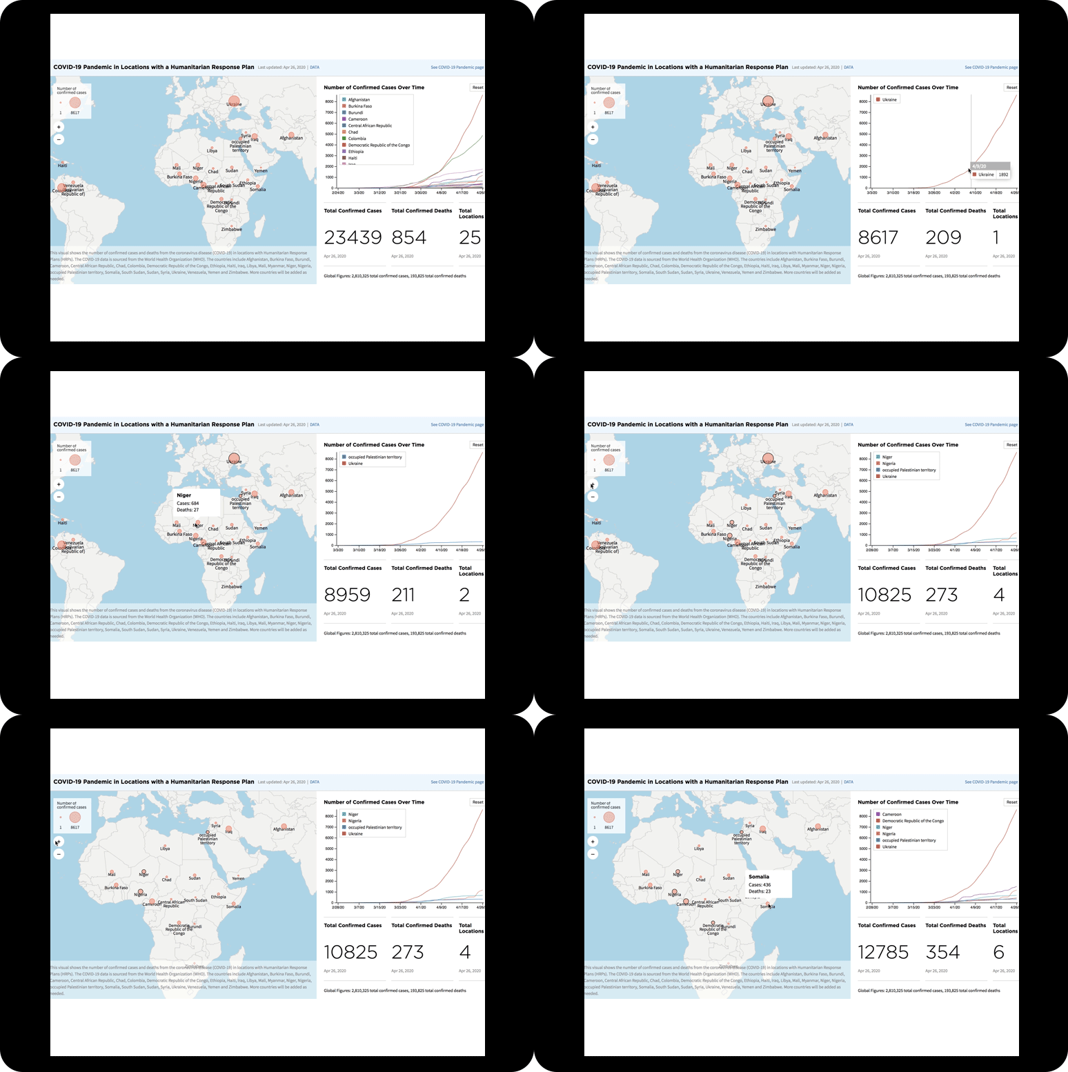
There are two other ways geographic data is visualized in the map. The gray proportional circles indicating the number of COVID-19 cases (global view) are loaded as a simple geojson point file and joined to the cases data. In each country view, you can also see an image layer representing the population density across the country. This layer was generated from the Worldpop ‘people per pixel’ raster datasets, which were styled in QGIS and exported as a rendered image for loading into the Mapbox raster tiles service. Both the vector tiles and raster tiles technologies are efficient ways to distribute only the needed parts of very large geographic datasets to users’ browsers.
Feedback
The work to create the COVID-19 map explorer has been a valuable learning experience from which we have gained insights into how we might improve data processing and visualization in the future. None of it would be possible without the contribution of our data sharing partners and we are grateful for their continued support for HDX. Send us feedback at hdx@un.org.
