Share
Yemen is known to be one of the world’s worst humanitarian crises, with an estimated 24 million people in need of assistance and around one in ten Yemenis internally displaced. Through my fellowship with the Centre, I developed a data story to help people better understand this complex emergency through the journey of a family forced to flee their home due to the conflict. Below is a snapshot of how the Yemen data story was developed and the approach I took to building it.
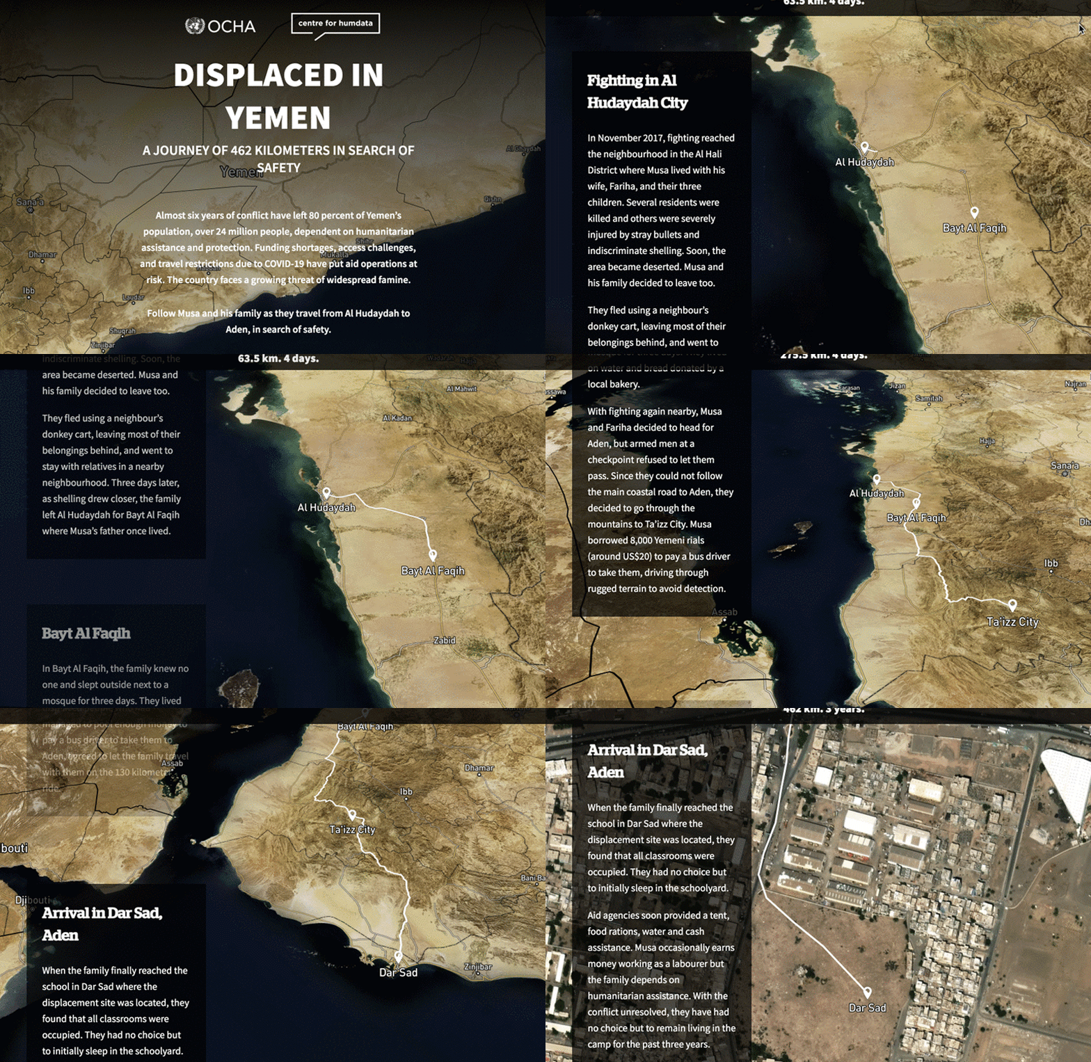
The idea for this data story came from the OCHA Yemen office following the success of the Centre’s data stories on South Sudan, developed by the 2018 Data Storytelling Fellow, and the Central African Republic, released in 2019. Similar to these stories, ‘Displaced In Yemen’ takes the audience on the journey of a single family as they leave their home in Al Hudaydah on the west coast and travel south to Aden in search of safety.
The crisis in Yemen has been going on for almost six years and much has been communicated about the dire humanitarian situation there. My challenge was to help OCHA find new ways to convey the scale and urgency of the crisis and to mobilize much-needed resources. I began my research by understanding the perspective of the OCHA staff in Yemen.
“Over the years, we’ve been focusing on the cholera outbreak and the issues around food insecurity, but we haven’t told the story of people who had to leave their homes and livelihoods. We’re talking about huge numbers, more than three million being displaced, with some having gone through multiple displacements. We want to convey what it means to be displaced, the journey and what people face along it.” – Saleh Alzaghari, Public Information Officer, OCHA Yemen
From concept to prototype
Data storytelling uses techniques – such as zooming in on a specific character whose life is disrupted by an incident – to allow audiences to immerse themselves in the reality of a situation. It combines narrative with data and visual information. It has the potential to enable audiences to connect on a human and emotional level to an experience.
The Yemen data story puts one family’s displacement experience at the center, using a map to show the points in the 462 kilometre journey. The narrative boxes convey the hardships, obstacles and dangers the family faces as they travel by donkey cart and by bus to a displacement camp in Dar Sad, Aden.
For the data, I relied on the datasets from the Humanitarian Data Exchange (HDX) and referenced in the Yemen 2020 Humanitarian Response Plan and the Yemen 2019 Humanitarian Needs Overview. I supplemented these sources with data and reports from different external sources.
Given the sensitivity of the context, we had to make sure that the data and information presented would not put anyone at risk. For this reason, although the story is based on the actual experience of a displaced family in Yemen, the names Ahmed and Fariha are fictional.
As I started exploring the different datasets in more depth and working them into my draft mockup and narrative, it became clear that not all of the intended visualisations added value to the overall story. I also realised that I lacked information (or up-to-date data) for some of the planned interactive visuals and had to revisit my initial design several times.
My work on the Yemen data story allowed me to refine my skills and expertise in communications and editing, data visualisation and design, and user experience and engagement. I got to do more data exploration than I usually would have and enjoyed using tools such as MapBox and Flourish to customize the map and create animated and interactive data visuals for a richer user experience. After two months of hard work, I was able to deliver a prototype data story ready for development by the Centre and OCHA Yemen.
Recommendations for data storytelling
Data storytelling can be a powerful tool to drive action but is not a one-size-fits-all solution. The right approach will depend on the Centre’s target audience and the desired impact from a given story. The evolving digital world continues to offer new possibilities of reaching users and enhancing their experiences, and I encourage the Centre to explore innovative tools and techniques in future data stories. I also recommend that the Centre analyzes in more detail – through tools such as Hotjar and user experience research – how people interact with the data stories and to what extent they respond to the call to action.
Finally, I encourage the Centre to consider producing practical guidance for the sector on how to ensure the responsible use of information in the context of data storytelling. It is of critical importance to consider each piece of the data story – narrative, data, displacement route, and visuals – to understand if the level of detail is enough to form a story and yet appropriate to ensure the ‘do no harm’ principle.
* * * * *
Learn more about the 2020 Data Fellows Programme and watch the video of the Data Fellows Programme Showcase. The new roles for our 2021 programme will be announced in February or March 2021.
