Share
As a Statistics Data Fellow with the Centre, I explored two methods for analyzing data related to difficulties in functioning and barriers to opportunity as a way to better understand disability prevalence in crisis contexts. In this blog, I present my approach, the outcomes of my project, and recommendations on how the Centre and its partners can further apply these methods to inform more inclusive humanitarian response.
The key takeaways include:
- People with disabilities often suffer worse outcomes than the general population because their needs are not recognized by their community and those responding.
- It may be possible to shorten the question set used to assess disability prevalence among affected people but still derive the same information.
- The analysis shows significant correlations between cash and food and Washington Group Questions on anxiety, depression and fatigue, indicating that increasing the coverage and amount of cash assistance programming may have a significant impact on both feelings of food security and mental well-being.
- The recommended ‘cutoff’ for calculating disability prevalence using the Washington Group Questions works well, but analysis of cutoff choices should be continued to understand how disability classification is related to environmental factors.
- Organizations should incorporate the Washington Group Questions into data collection instruments, and disability inclusive datasets should be shared responsibly to support insights and a more targeted response.
Disability Inclusion
The inclusion of persons with disabilities in humanitarian response has been a priority of the global humanitarian system since the ratification of the Convention on the Rights of Persons with Disability in 2006. But how do we know if someone in a crisis has a disability or not? What do we need to know about their living environment that could intensify differences in abilities or even create disabilities?
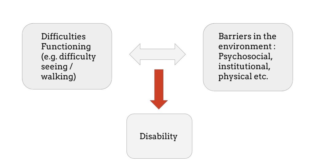
People with disabilities are among the most vulnerable in a humanitarian crisis. They often suffer worse outcomes than the general population because their specific needs are not recognized by their community and those responding. The International Classification on Functioning, Disability and Health (ICF) states that disability arises through an interaction between a person’s difficulties in functioning (which can include health impairments) and barriers to opportunity and equal participation in society that are created by an unaccomodating environment.
Disability prevalence amongst Syrian refugees
To gain a better understanding of the interaction between difficulties in functioning and barriers, I analyzed two different datasets on Syrian people affected by the Syrian conflict. One of these datasets came from a study conducted by Humanity & Inclusion (HI) and iMMAP. They surveyed Syrian refugees — adults and minors — living in camps in Jordan and Lebanon in 2017-18. The second dataset was collected by REACH and Impact Initiatives; they surveyed Syrian populations living (many internally displaced) in three Northern Syrian Governorates.
The analysis below is focused on the first dataset from HI and iMMAP. To help accurately identify disability, their survey incorporated the widely used Washington Group Questions (WGQ) on disability for adults and the UNICEF child functioning module (CFM) for children. Both questionnaires target activity limitations such as difficulty in seeing, hearing or walking. Answers were recorded on a scale from ‘No difficulty at all’ to ‘Cannot do at all.’ The survey also asked questions on a variety of domains describing the barriers in their environment, including access to clean water, cash assistance, shelter and food, among others.
Method #1: Mutual Information – visualizing correlations among survey questions
To look for a relationship between difficulties functioning (as measured by the WGQ) and environmental barriers, I computed the Mutual Information (MI) between the different variables measured (i.e., questions asked) in the survey. Mutual Information comes from Information Theory and measures how much uncertainty in one random variable (call it ‘X’) is reduced by the knowledge of another variable (call it ‘Y’). One can also see it as a measure of statistical dependence, or in simple words correlation. If X and Y are statistically independent, mutual information is 0. If they are dependent, mutual information is > 0.
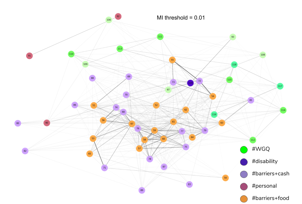
My computation of Mutual Information in the dataset on (adult) Syrian refugees looked at how functional difficulties as measured by the WGQ correlates with barriers related to cash assistance, food services and factors such as age, gender and employment. We can plot a network of nodes (circles) representing the variables measured in the survey and links between nodes will exist if the (normalized) Mutual Information is at least 0.01. The thickness of the edge corresponds to the relative amount of Mutual Information in the network. Here is what the graph of my analysis looks like:
NB: n = 3,866 Syrian adults
By inspecting the graph, we find strong correlations between cash assistance questions (purple nodes) and food-related questions (orange nodes). There are also significant correlations between cash and food and Washington Group Questions on anxiety, depression and fatigue (green nodes, numbers 112-118). This might indicate that increasing the coverage and amount of cash assistance programming may have a significant impact on both feelings of food security and mental well-being. We also see that gender (rose nodes, number 91) is correlated with employment (node 92) because it was found that female refugees are largely unemployed, and age (node 90) is correlated with variables such as ‘difficulty walking and climbing steps’ (node 97).
We can also find other useful insights from studying correlations. The two pairs of variables with the highest correlations in the graph of the entire dataset (not shown in the figure) are the following:
- ‘#barriers+food_Safety fears for movement outside home (attack, harassment, arrested)?’ and ‘#barriers+cash_Safety fears for movement outside home (attack, harassment, arrested)?’ with an MI of 0.48.
- ‘#barriers+food_I do not have documents to access services (Specify types of documents: eg UNHCR card, visa, ID)?’ and ‘#barriers+cash_I do not have documents to access services (Specify types of documents: eg UNHCR card, visa, ID)?’ with an MI of 0.39.
Each pair has the same question asked in a different category, once for food and once for cash. This correlation indicates that the participants find these questions highly similar or inter-related in some mechanistic sense. This can be grounds for reducing the size of the questionnaire by merging such questions in the future. A shorter questionnaire is desirable especially in a humanitarian setting where many people have to be surveyed in a short time, often under difficult circumstances. A caveat of MI calculation is sample size: the higher the sample size, the more robust the estimate. In this case, I have only compared two variables if there were at least 200 common data points for comparison.
The graph also shows an indicator for persons with disability (dark blue nodes) linked to disability domains such as visual impairments (node 93), difficulty walking (node 97) and age (node 90). This indicator is calculated based on the following cutoff: if the answer to any of the WGQ is ‘a lot of difficulty’ or higher (ignoring some details), that person is classified as having a disability. This leads to a disability prevalence of 22.9% in the Jordan refugee camps as reported in the survey.
However, different choices of cutoffs can lead to different disability prevalences and include/exclude different sets of people. Also, the WGQ only probe difficulties functioning and do not capture information about environmental barriers. These issues show that calculating who is or is not a person with disability is quite complex due to the continuum of disabilities observed in the population.
Method #2: Principal Component Analysis – capturing both functional difficulties and environmental barriers
I was interested in computational ways of visualizing disability while also taking environmental barriers into account. To do so, I computed the principal components that explain most of the variance in the data, using a special, non-linear version of Principal Component Analysis (PCA) called Categorical PCA (De Leeuw and colleagues, function princals in the Gifi package in R). Using this method, I reduced each adult’s answers to 120 questions (WGQ + barriers) to a space of 40 dimensions which explain 99% of the variance. Here is a look at the data in the first two principal components (named D1 and D2):
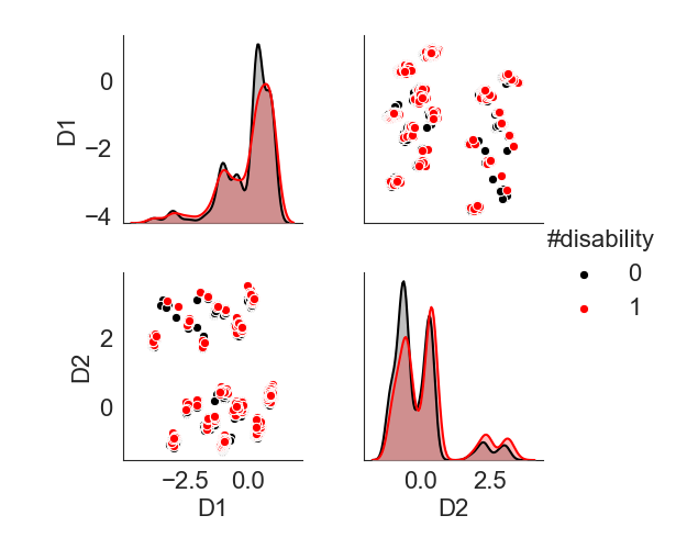
Each dot in the top right and bottom left panels is a person in the dataset. Both panels show the same plot just flipped. I colored the dots based on the disability indicator: 0 = person without disability (black); 1 = with disability (red) using the cutoff applied in the study. The panels on the diagonal show kernel density plots (smooth histograms) of the distribution of the data along each component. Component D1 and D2 account for 32% of the variance in the data. From looking at the distribution plots along the diagonal, it does not appear that people with and without disability are dissimilar because the distributions are overlapping.
However, we are looking at the data in two dimensions while the data lives in 40, which cannot simultaneously be visualized. It makes sense to reduce this dimensionality to just one axis (a vector in 40 dimensional space), an axis that provides the largest ‘separation’ amongst the two populations. I use Linear Discriminant Analysis (LDA description and code) to find this axis. After we project the data on to this axis, we get the following distribution (left panel below).
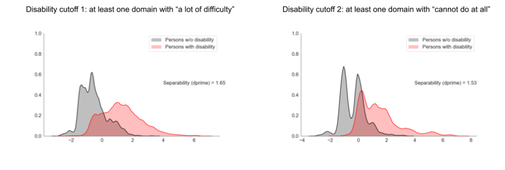
In the panel on the left, we now see some amount of separation between people without disability (black) and with disability (red). There is a considerable amount of overlap, and this is probably due to the similar barriers faced by people below the cutoff and people above. However, clearly the WGQ cutoff is useful since it does produce a strong right tail in the disability population. One can compute a measure of separability between these distributions using Statistical Decision Theory. This measure is called d-prime or sensitivity index. Here the d-prime = 1.65.
What happens if we raise the threshold? If we put the cutoff at ‘Cannot do at all’ (highest activity limitation level) in at least one WGQ domain, we get the distributions in the right panel.
Unsurprisingly, the disability prevalence drops by almost half because fewer people are included by the higher threshold. However, the separability between the two distributions has not increased, rather slightly decreased (d-prime = 1.53). This indicates that such a cutoff does not distinguish persons with or without disability and only reduces the prevalence rate. Thus, this analysis indicates that the recommended WGQ cutoff works well, but it can be taken further to inspect which factors are correlated with disability classification.
Recommendations and next steps
Based on the research I conducted during my Fellowship, I have the following recommendations for applying advanced statistical techniques to improve analysis of disability in humanitarian contexts:
- To the Centre for Humanitarian Data: Work with organizations collecting data on people with disabilities to advise them on developing standardized surveys which ask the same (or at least very similar) questions on both functional difficulties and environmental barriers. Another tool for standardization is the HXL tag format. I used HXL tags to explore ways disability actors can categorize their survey questions such as ‘#barriers+cash” or “#barriers+water” or “#wgq”. I used such hashtags to color the graph shared earlier. This will increase the interoperability of disability data and promote data-sharing through the Humanitarian Data Exchange.
- To UN Country Offices and Disabled Persons Organizations: Incorporate the WGQ into data collection instruments and enrich disability datasets with administrative data on the type, number and status of public infrastructure, government run services and national census data. Greater collaboration between UN agencies and national statistics offices could also help in this regard.
- To data analysts, researchers and survey designers: Use correlation analysis methods to reduce the length of questionnaires and build models between important variables to make predictions or assess the impact of interventions to those variables.
- To the humanitarian community: Collect and share disability inclusive datasets responsibly to support statistically robust and generalizable insights. Data responsibility includes a thorough understanding of the re-identification risks associated with collecting personal data. Statistical Disclosure Control (SDC) is a process that helps humanitarian organizations involved in sensitive data collection assess and mitigate the risk of re-identification. See the Centre’s recent Guidance Note on SDC for more information on this practice.
A caveat of this work is that the two surveys are only focused on Syrian populations living in and outside Syria. Also, the survey questionnaires contained only partly overlapping questions, which constrains our ability to generalize knowledge. I am currently working with OCHA Country Offices to support their analysis focused on disability. Some of the analysis will use the techniques I developed during my Fellowship. However, given the short duration of the project, the analysis can definitely improve from further statistical rigor and deeper insight into disability from domain experts. Please share any feedback through centrehumdata@un.org.
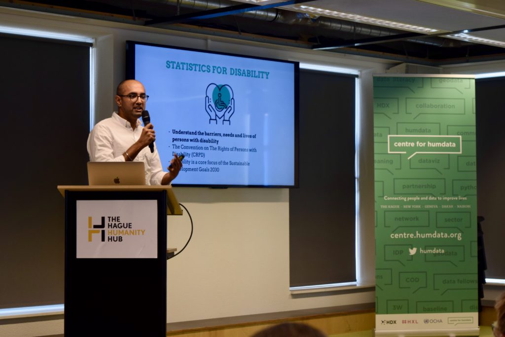
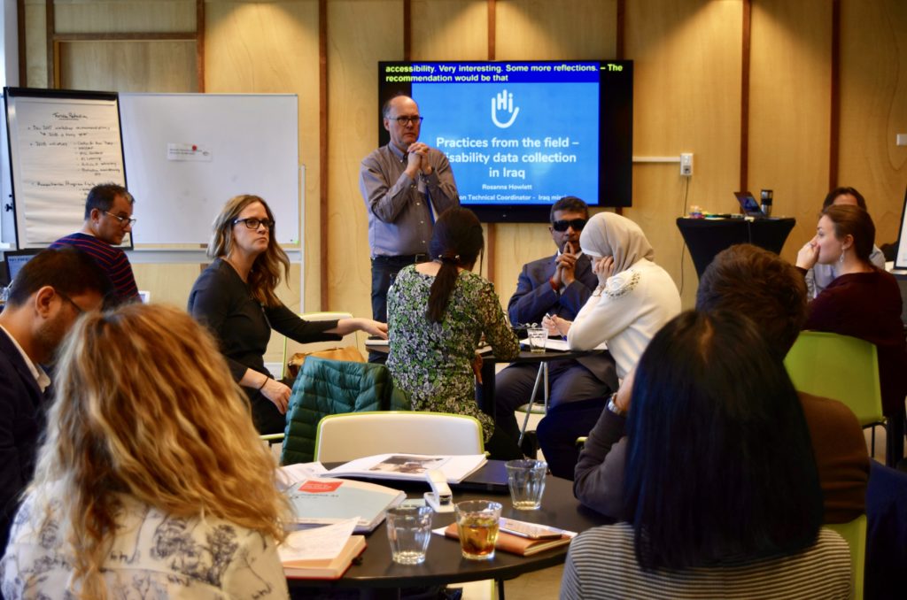
Watch Gagan Narula present the results of his fellowship on disability statistics at the Centre’s Data Fellows Programme Showcase event in The Hague in July 2019.
The Centre’s Data Fellows Programme is undertaken in partnership with the Education Above All Foundation. Learn more about the 2019 Data Fellows Programme, see video and photos from final presentations at the Data Fellows Programme Showcase, and read about the work from the Programme Lead and Data Science (Education), Predictive Analytics, and Business Strategy Fellows.
